2024 DesignSpatial ComputingSwiftUI & UI Frameworks
WWDC24 · 17 min · Design / Spatial Computing / SwiftUI & UI Frameworks
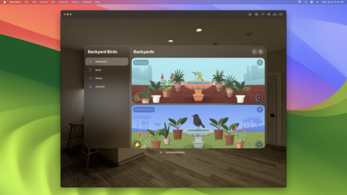
Create custom hover effects in visionOS
Learn how to develop custom hover effects that update views when people look at them. Find out how to build an expanding button effect that combines opacity, scale, and clip effects. Discover best practices for creating effects that are comfortable and respect people’s accessibility needs.
Watch at developer.apple.com ↗Chapters
Code shown on screen · 8 snippets
Button with Scale Effect
struct ProfileButtonView: View {
    var action: () -> Void = { }
    var body: some View {
        Button(action: action) {
            HStack(spacing: 2) {
                ProfileIconView()
                ProfileDetailView()
            }
        }
        .buttonStyle(ProfileButtonStyle())
    }

    struct ProfileButtonStyle: ButtonStyle {
        func makeBody(configuration: Configuration) -> some View {
            configuration.label
                .background(.thinMaterial)
                .hoverEffect(.highlight)
                .clipShape(.capsule)
                .hoverEffect { effect, isActive, _ in
                    effect.scaleEffect(isActive ? 1.05 : 1.0)
                }
        }
    }

    struct ProfileIconView: View {
        var body: some View {
            Image(systemName: "person.crop.circle")
                .resizable()
                .scaledToFit()
                .frame(width: 44, height: 44)
                .padding(6)
        }
    }

    struct ProfileDetailView: View {
        var body: some View {
            VStack(alignment: .leading) {
                Text("Peter McCullough")
                    .font(.body)
                    .foregroundStyle(.primary)
                Text("Switch profiles")
                    .font(.footnote)
                    .foregroundStyle(.tertiary)
            }
            .padding(.trailing, 24)
        }
    }
}
Button with Clip and Scale Effects
struct ProfileButtonView: View {
    var action: () -> Void = { }
    var body: some View {
        Button(action: action) {
            HStack(spacing: 2) {
                ProfileIconView()
                ProfileDetailView()
            }
        }
        .buttonStyle(ProfileButtonStyle())
    }

    struct ProfileButtonStyle: ButtonStyle {
        func makeBody(configuration: Configuration) -> some View {
            configuration.label
                .background(.thinMaterial)
                .hoverEffect(.highlight)
                .hoverEffect { effect, isActive, proxy in
                    effect.clipShape(.capsule.size(
                        width: isActive ? proxy.size.width : proxy.size.height,
                        height: proxy.size.height,
                        anchor: .leading
                    ))
                    .scaleEffect(isActive ? 1.05 : 1.0)
                }
        }
    }

    struct ProfileIconView: View {
        var body: some View {
            Image(systemName: "person.crop.circle")
                .resizable()
                .scaledToFit()
                .frame(
                    width: 44,
                    height: 44
                )
                .padding(6)
        }
    }

    struct ProfileDetailView: View {
        var body: some View {
            VStack(alignment: .leading) {
                Text("Peter McCullough")
                    .font(.body)
                    .foregroundStyle(.primary)
                Text("Switch profiles")
                    .font(.footnote)
                    .foregroundStyle(.tertiary)
            }
            .padding(.trailing, 24)
        }
    }
}
Expanding Button with Ungrouped Fade
struct ProfileButtonView: View {
    var action: () -> Void = { }
    var body: some View {
        Button(action: action) {
            HStack(spacing: 2) {
                ProfileIconView()
                ProfileDetailView()
                    .hoverEffect { effect, isActive, _ in
                        effect.opacity(isActive ? 1 : 0)
                    }
            }
        }
        .buttonStyle(ProfileButtonStyle())
    }

    struct ProfileButtonStyle: ButtonStyle {
        func makeBody(configuration: Configuration) -> some View {
            configuration.label
                .background(.thinMaterial)
                .hoverEffect(.highlight)
                .hoverEffect { effect, isActive, proxy in
                    effect.clipShape(.capsule.size(
                        width: isActive ? proxy.size.width : proxy.size.height,
                        height: proxy.size.height,
                        anchor: .leading
                    ))
                    .scaleEffect(isActive ? 1.05 : 1.0)
                }
        }
    }

    struct ProfileIconView: View {
        var body: some View {
            Image(systemName: "person.crop.circle")
                .resizable()
                .scaledToFit()
                .frame(width: 44, height: 44)
                .padding(6)
        }
    }

    struct ProfileDetailView: View {
        var body: some View {
            VStack(alignment: .leading) {
                Text("Peter McCullough")
                    .font(.body)
                    .foregroundStyle(.primary)
                Text("Switch profiles")
                    .font(.footnote)
                    .foregroundStyle(.tertiary)
            }
            .padding(.trailing, 24)
        }
    }
}
Expanding Button with Explicit Group
struct ProfileButtonView: View {
var action: () -> Void = { }
var hoverNamespace
var hoverGroup: HoverEffectGroup {
HoverEffectGroup(hoverNamespace)
}
var body: some View {
Button(action: action) {
HStack(spacing: 2) {
ProfileIconView()
ProfileDetailView()
.hoverEffect(in: hoverGroup) { effect, isActive, _ in
effect.opacity(isActive ? 1 : 0)
}
}
}
.buttonStyle(ProfileButtonStyle(hoverGroup: hoverGroup))
}
struct ProfileIconView: View {
var body: some View {
Image(systemName: "person.crop.circle")
.resizable()
.scaledToFit()
.frame(width: 44, height: 44)
.padding(6)
}
}
struct ProfileDetailView: View {
var body: some View {
VStack(alignment: .leading) {
Text("Peter McCullough")
.font(.body)
.foregroundStyle(.primary)
Text("Switch profiles")
.font(.footnote)
.foregroundStyle(.tertiary)
}
.padding(.trailing, 24)
}
}
}
struct ProfileButtonStyle: ButtonStyle {
var hoverGroup: HoverEffectGroup?
func makeBody(configuration: Configuration) -> some View {
configuration.label
.background(.thinMaterial)
.hoverEffect(.highlight, in: hoverGroup)
.hoverEffect(in: hoverGroup) { effect, isActive, proxy in
effect.clipShape(.capsule.size(
width: isActive ? proxy.size.width : proxy.size.height,
height: proxy.size.height,
anchor: .leading
))
.scaleEffect(isActive ? 1.05 : 1.0)
}
}
}Expanding Button with Implicit Group
struct ProfileButtonView: View {
    var action: () -> Void = { }
    var body: some View {
        Button(action: action) {
            HStack(spacing: 2) {
                ProfileIconView()
                ProfileDetailView()
                    .hoverEffect { effect, isActive, _ in
                        effect.opacity(isActive ? 1 : 0)
                    }
            }
        }
        .buttonStyle(ProfileButtonStyle())
        .hoverEffectGroup()
    }

    struct ProfileButtonStyle: ButtonStyle {
        func makeBody(configuration: Configuration) -> some View {
            configuration.label
                .background(.thinMaterial)
                .hoverEffect(.highlight)
                .hoverEffect { effect, isActive, proxy in
                    effect.clipShape(.capsule.size(
                        width: isActive ? proxy.size.width : proxy.size.height,
                        height: proxy.size.height,
                        anchor: .leading
                    ))
                    .scaleEffect(isActive ? 1.05 : 1.0)
                }
        }
    }

    struct ProfileIconView: View {
        var body: some View {
            Image(systemName: "person.crop.circle")
                .resizable()
                .scaledToFit()
                .frame(
                    width: 44,
                    height: 44
                )
                .padding(6)
        }
    }

    struct ProfileDetailView: View {
        var body: some View {
            VStack(alignment: .leading) {
                Text("Peter McCullough")
                    .font(.body)
                    .foregroundStyle(.primary)
                Text("Switch profiles")
                    .font(.footnote)
                    .foregroundStyle(.tertiary)
            }
            .padding(.trailing, 24)
        }
    }
}
Expanding Button with Delayed Effect
struct ProfileButtonView: View {
    var action: () -> Void = { }
    var body: some View {
        Button(action: action) {
            HStack(spacing: 2) {
                ProfileIconView()
                ProfileDetailView()
                    .hoverEffect { effect, isActive, _ in
                        effect.animation(.default.delay(isActive ? 0.8 : 0.2)) {
                            $0.opacity(isActive ? 1 : 0)
                        }
                    }
            }
        }
        .buttonStyle(ProfileButtonStyle())
        .hoverEffectGroup()
    }

    struct ProfileButtonStyle: ButtonStyle {
        func makeBody(configuration: Configuration) -> some View {
            configuration.label
                .background(.thinMaterial)
                .hoverEffect(.highlight)
                .hoverEffect { effect, isActive, proxy in
                    effect.animation(.default.delay(isActive ? 0.8 : 0.2)) {
                        $0.clipShape(.capsule.size(
                            width: isActive ? proxy.size.width : proxy.size.height,
                            height: proxy.size.height,
                            anchor: .leading
                        ))
                    }.scaleEffect(isActive ? 1.05 : 1.0)
                }
        }
    }

    struct ProfileIconView: View {
        var body: some View {
            Image(systemName: "person.crop.circle")
                .resizable()
                .scaledToFit()
                .frame(
                    width: 44,
                    height: 44
                )
                .padding(6)
        }
    }

    struct ProfileDetailView: View {
        var body: some View {
            VStack(alignment: .leading) {
                Text("Peter McCullough")
                    .font(.body)
                    .foregroundStyle(.primary)
                Text("Switch profiles")
                    .font(.footnote)
                    .foregroundStyle(.tertiary)
            }
            .padding(.trailing, 24)
        }
    }
}
Expanding Button with Reusable Effects
struct ProfileButtonView: View {
    var action: () -> Void = { }
    var body: some View {
        Button(action: action) {
            HStack(spacing: 2) {
                ProfileIconView()
                ProfileDetailView()
                    .hoverEffect(FadeEffect())
            }
        }
        .buttonStyle(ProfileButtonStyle())
        .hoverEffectGroup()
    }

    struct ProfileButtonStyle: ButtonStyle {
        func makeBody(configuration: Configuration) -> some View {
            configuration.label
                .background(.thinMaterial)
                .hoverEffect(.highlight)
                .hoverEffect(ExpandEffect())
        }
    }

    struct ExpandEffect: CustomHoverEffect {
        func body(content: Content) -> some CustomHoverEffect {
            content.hoverEffect { effect, isActive, proxy in
                effect.animation(.default.delay(isActive ? 0.8 : 0.2)) {
                    $0.clipShape(.capsule.size(
                        width: isActive ? proxy.size.width : proxy.size.height,
                        height: proxy.size.height,
                        anchor: .leading
                    ))
                }.scaleEffect(isActive ? 1.05 : 1.0)
            }
        }
    }

    struct FadeEffect: CustomHoverEffect {
        var from: Double = 0
        var to: Double = 1

        func body(content: Content) -> some CustomHoverEffect {
            content.hoverEffect { effect, isActive, _ in
                effect.animation(.default.delay(isActive ? 0.8 : 0.2)) {
                    $0.opacity(isActive ? to : from)
                }
            }
        }
    }

    struct ProfileIconView: View {
        var body: some View {
            Image(systemName: "person.crop.circle")
                .resizable()
                .scaledToFit()
                .frame(
                    width: 44,
                    height: 44
                )
                .padding(6)
        }
    }

    struct ProfileDetailView: View {
        var body: some View {
            VStack(alignment: .leading) {
                Text("Peter McCullough")
                    .font(.body)
                    .foregroundStyle(.primary)
                Text("Switch profiles")
                    .font(.footnote)
                    .foregroundStyle(.tertiary)
            }
            .padding(.trailing, 24)
        }
    }
}
Final Expanding Button with Accessibility Support
struct ProfileButtonView: View {
var action: () -> Void = { }
var body: some View {
Button(action: action) {
HStack(spacing: 2) {
ProfileIconView()
ProfileDetailView()
.hoverEffect(FadeEffect())
}
}
.buttonStyle(ProfileButtonStyle())
.hoverEffectGroup()
}
struct ProfileButtonStyle: ButtonStyle {
(\.accessibilityReduceMotion) var reduceMotion
func makeBody(configuration: Configuration) -> some View {
configuration.label
.background {
ZStack(alignment: .leading) {
Capsule()
.fill(.thinMaterial)
.hoverEffect(.highlight)
.hoverEffect(
reduceMotion ? HoverEffect(FadeEffect()) : HoverEffect(.empty))
if reduceMotion {
Circle()
.fill(.thinMaterial)
.hoverEffect(.highlight)
.hoverEffect(FadeEffect(from: 1, to: 0))
}
}
}
.hoverEffect(
reduceMotion
? HoverEffect(.empty)
: HoverEffect(ExpandEffect())
)
}
}
struct ExpandEffect: CustomHoverEffect {
func body(content: Content) -> some CustomHoverEffect {
content.hoverEffect { effect, isActive, proxy in
effect.animation(.default.delay(isActive ? 0.8 : 0.2)) {
$0.clipShape(.capsule.size(
width: isActive ? proxy.size.width : proxy.size.height,
height: proxy.size.height,
anchor: .leading
))
}.scaleEffect(isActive ? 1.05 : 1.0)
}
}
}
struct FadeEffect: CustomHoverEffect {
var from: Double = 0
var to: Double = 1
func body(content: Content) -> some CustomHoverEffect {
content.hoverEffect { effect, isActive, _ in
effect.animation(.default.delay(isActive ? 0.8 : 0.2)) {
$0.opacity(isActive ? to : from)
}
}
}
}
struct ProfileIconView: View {
var body: some View {
Image(systemName: "person.crop.circle")
.resizable()
.scaledToFit()
.frame(
width: 44,
height: 44
)
.padding(6)
}
}
struct ProfileDetailView: View {
var body: some View {
VStack(alignment: .leading) {
Text("Peter McCullough")
.font(.body)
.foregroundStyle(.primary)
Text("Switch profiles")
.font(.footnote)
.foregroundStyle(.tertiary)
}
.padding(.trailing, 24)
}
}
}Resources
Related sessions
-
 16 min
 -
 32 min