2025 DesignSwiftUI & UI Frameworks
WWDC25 · 22 min · Design / SwiftUI & UI Frameworks
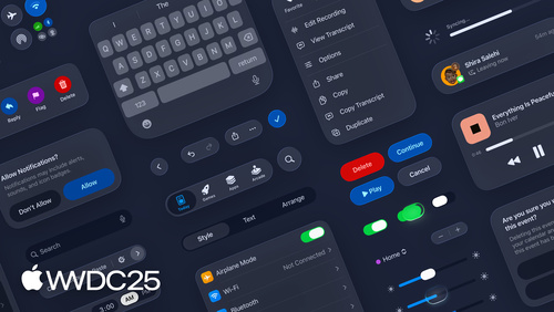
Build a SwiftUI app with the new design
Explore the ways Liquid Glass transforms the look and feel of your app. Discover how this stunning new material enhances toolbars, controls, and app structures across platforms, providing delightful interactions and seamlessly integrating your app with the system. Learn how to adopt new APIs that can help you make the most of Liquid Glass.
Watch at developer.apple.com ↗Chapters
Code shown on screen · 28 snippets
Segmented Picker
Picker("View", selection: $selection) {
    Text("Map").tag(ViewMode.map)
    Text("List").tag(ViewMode.list)
}
.pickerStyle(.segmented)
Extend background images
// Extend background images

struct LandmarkDetailView: View {
    let landmark: Landmark

    var body: some View {
        ScrollView {
            VStack {
                Image(landmark.backgroundImageName)
                    .resizable()
                    .aspectRatio(contentMode: .fill)
                    .backgroundExtensionEffect()
            }
        }
    }
}
Adding an inspector
// Adding an inspector

NavigationSplitView {
    // sidebar
} detail: {
    // detail
}
.inspector(isPresented: $presentInspector) {
    LandmarkDetailInspectorView(landmark: landmark)
}
Minimize tab bar on scroll
// Minimize tab bar on scroll

TabView {
    // tabs
}
.tabBarMinimizeBehavior(.onScrollDown)
Tab bar accessory
// Tab bar accessory
TabView {
// tabs
}
.tabBarMinimizeBehavior(.onScrollDown)
.tabViewBottomAccessory {
MusicPlaybackView()
}
struct MusicPlaybackView: View {
(\.tabViewBottomAccessoryPlacement)
var placement
var body: some View {
if placement == .inline {
// compact layout
} else {
// full layout
}
}
}Sheets with presentation detents
// Sheets

CollectionDetailView()
    .sheet(isPresented: $isShowingLandmarksSelection) {
        LandmarksSelectionList()
            .presentationDetents([.height(180), .medium, .large])
    }
Presentation background
// Presentation background

CollectionDetailView()
    .sheet(isPresented: $isShowingLandmarksSelection) {
        LandmarksSelectionList()
            .presentationDetents([.height(180), .medium, .large])
            .presentationBackground(.thickMaterial)
    }
Zoom transition
// Zoom transition
private var namespace
ContentView()
.toolbar {
ToolbarItem(placement: .bottomBar) {
Button {
isPresented = true
} label: {
Image(systemName: "map")
}
.matchedTransitionSource(
id: "transition-id", in: namespace)
}
}
.sheet(isPresented: $isPresented) {
SheetContent()
.navigationTransition(
.zoom(
sourceID: "transition-id", in: namespace))
}Toolbar menus
// Toolbar menus

LandmarkDetailView()
    .toolbar {
        ToolbarItemGroup {
            Button { } label: {
                Image(systemName: "square.and.arrow.up")
            }

            Menu(
                "Collections",
                systemImage: "book.closed"
            ) {
                // menu items
            }
        }
    }
Confirmation dialog
// Confirmation dialog

CollectionDetailView()
    .toolbar {
        Button("Delete", systemImage: "trash") {
            presentDialog = true
        }
        .confirmationDialog(
            "Delete?",
            isPresented: $presentDialog
        ) {
            Button("Delete", role: .destructive) { }
        }
    }
Visually separate toolbar items
// Visually separate toolbar items

struct LandmarkDetailView: View {
    var body: some View {
        ScrollView {
            ScrollContent()
        }
        .toolbar {
            ToolbarItem { ShareLink() }
            ToolbarSpacer(.fixed)
            ToolbarItem { FavoriteButton() }
            ToolbarItem { CollectionsButton() }
            ToolbarSpacer(.fixed)
            ToolbarItem { InspectorToggle() }
        }
    }
}
Toolbar items with flexible spacing
// Toolbar items with flexible spacing

struct InboxView: View {
    var body: some View {
        ScrollView {
            ScrollContent()
        }
        .toolbar {
            ToolbarItem(placement: .bottomBar) {
                FilterPicker()
            }
            ToolbarSpacer(.flexible, placement: .bottomBar)
            DefaultToolbarItem(
                kind: .search, placement: .bottomBar)
            ToolbarSpacer(.fixed, placement: .bottomBar)
            ToolbarItem(placement: .bottomBar) {
                NewMessageButton()
            }
        }
    }
}
Hide shared glass background
// Hide shared glass background

struct HomeView: View {
    var body: some View {
        ContentView()
            .toolbar {
                ToolbarItem {
                    ProfileButton()
                }
                .sharedBackgroundVisibility(.hidden)
            }
    }
}
Toolbar item with a badge
// Toolbar item with a badge
(ModelData.self) var modelData
CollectionsView()
.toolbar {
ToolbarItemGroup {
Button("Notifications", systemImage: "bell") { }
.badge(modelData.notifications.count)
Button("Add", systemImage: "plus") { }
}
}Hard scroll edge effect
// Hard scroll edge effect

ScrollView {
    // content
}
.scrollEdgeEffectStyle(.hard, for: .top)
Search in top-trailing position
// Search in the top-trailing position
struct TopTrailingSearch: View {
private var searchText = ""
var body: some View {
NavigationSplitView {
SidebarContent()
} detail: {
DetailContent()
}
.searchable(text: $searchText)
}
}Minimized search in toolbar
// Minimized search in the toolbar
struct MinimizedSearch: View {
private var searchText = ""
var body: some View {
NavigationStack {
DetailContent()
}
.searchable(text: $searchText)
.searchToolbarBehavior(.minimize)
}
}TabView with a search tab
// TabView with a search tab
struct ContentView: View {
private var searchText = ""
var body: some View {
TabView {
// other tabs
Tab(role: .search) {
NavigationStack {
SearchTabContent()
}
}
}
.searchable(text: $searchText)
}
}Capsule buttons
Button(…)
    .buttonBorderShape(.capsule)
Button sizes: high density layouts
// Button sizes: high density layouts

VStack {
    Picker("Inspector View Mode", selection: $mode) {
        // options
    }
    .controlSize(.large)

    InspectorStackView()
        .controlSize(.small)
}
Glass button styles
// Prominent glass button
Button("Get Started") { }
    .buttonStyle(.glassProminent)

// Standard glass button
Button("Learn More") { }
    .buttonStyle(.glass)
macOS menu icons
// Menus

Menu("Edit") {
    Section {
        Button("Undo",
               systemImage: "arrow.uturn.backward") { }
        Button("Redo",
               systemImage: "arrow.uturn.forward") { }
    }

    Section {
        Button("Copy",
               systemImage: "document.on.document") { }
        Button("Duplicate",
               systemImage: "plus.square.on.square") { }
    }
}
Concentric rectangle shape
// Concentric rectangle shape

CustomControl()
    .background(.tint, in: .rect(corner: .containerConcentric))
Glass effect
// Glass effect

Label("Desert", systemImage: "sun.max.fill")
    .padding()
    .glassEffect()
Glass effect: custom shape
// Customize shape

Label("Desert", systemImage: "sun.max.fill")
    .padding()
    .glassEffect(in: .rect(cornerRadius: 16))
Glass effect: tinted
// Tinted glass

Label("Desert", systemImage: "sun.max.fill")
    .padding()
    .glassEffect(.regular.tint(.green))
Glass effect: interactive
// Interactive glass

Label("Desert", systemImage: "sun.max.fill")
    .padding()
    .glassEffect(.regular.interactive())
Glass morphing with GlassEffectContainer
// GlassEffectContainer
var namespace
GlassEffectContainer {
VStack {
if isExpanded {
VStack(spacing: 16) {
ForEach(badges) { badge in
BadgeLabel(badge: badge)
.glassEffect()
.glassEffectID(badge.id, in: namespace)
}
}
}
BadgeToggle()
.buttonStyle(.glass)
.glassEffectID("badgeToggle", in: namespace)
}
}Resources
Related sessions
-
 18 min