2025 SwiftUI & UI Frameworks
WWDC25 · 22 min · SwiftUI & UI Frameworks
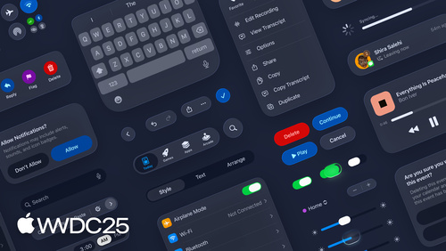
Build an AppKit app with the new design
Update your AppKit app to take full advantage of the new design system. We’ll dive into key changes to tab views, split views, bars, presentations, search, and controls, and show you how to use Liquid Glass in your custom UI. To get the most out of this video, we recommend first watching “Get to know the new design system” for general design guidance.
Watch at developer.apple.com ↗Chapters
Code shown on screen · 8 snippets
Removing toolbar item glass
// Removing toolbar item glass

toolbarItem.isBordered = false
Tinted toolbar controls
// Tints the glass with the accent color.
toolbarItem.style = .prominent

// Tints the glass with a specific color.
toolbarItem.backgroundTintColor = .systemGreen
Toolbar badges
// Numeric badge
NSItemBadge.count(4)

// Text badge
NSItemBadge.text("New")

// Badge indicator
NSItemBadge.indicator
Content under the sidebar
// Content under the sidebar

splitViewItem.automaticallyAdjustsSafeAreaInsets = true
Avoiding a window corner
// Avoiding a window corner


func updateConstraints() {
    guard !installedButtonConstraints else { return }

    let safeArea = layoutGuide(for: .safeArea(cornerAdaptation: .horizontal))

    NSLayoutConstraint.activate([
        safeArea.leadingAnchor.constraint(equalTo: button.leadingAnchor),
        safeArea.trailingAnchor.constraint(greaterThanOrEqualTo: button.trailingAnchor),
        safeArea.bottomAnchor.constraint(equalTo: button.bottomAnchor)
    ])
    installedButtonConstraints = true
}
Levels of prominence
// Create buttons with varying levels of prominence

// Prefer a “secondary” tinted appearance for the shuffle and enqueue buttons
shuffleButton.tintProminence = .secondary
playNextButton.tintProminence = .secondary

// The "play" will automatically use primary prominence because it is the default button
playButton.keyEquivalent = "\r"
Adopting NSGlassEffectView
// Adopting NSGlassEffectView

let userInfoView = UserInfoView()
let activityPickerView = ActivityPickerView()

let userInfoGlass = NSGlassEffectView()
userInfoGlass.contentView = userInfoView

let activityPickerGlass = NSGlassEffectView()
activityPickerGlass.contentView = activityPickerView

let stack = NSStackView(views: [userInfoGlass,
                                activityPickerGlass])
stack.orientation = .horizontal
Adopting NSGlassEffectContainerView
// Adopting NSGlassEffectContainerView

let userInfoView = UserInfoView()
let activityPickerView = ActivityPickerView()

let userInfoGlass = NSGlassEffectView()
userInfoGlass.contentView = userInfoView
userInfoGlass.cornerRadius = 999

let activityPickerGlass = NSGlassEffectView()
activityPickerGlass.contentView = activityPickerView
activityPickerGlass.cornerRadius = 999

let stack = NSStackView(views: [userInfoGlass,
                                activityPickerGlass])
stack.orientation = .horizontal

let glassContainer = NSGlassEffectContainerView()
glassContainer.contentView = stack
Resources
Related sessions
-
 18 min
 -
 20 min