2025 App ServicesSafari & Web
WWDC25 · 47 min · App Services / Safari & Web
What’s new in Safari and WebKit
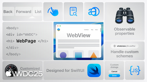
Learn how the latest web technologies in Safari and WebKit can help you create incredible experiences. We’ll highlight different CSS features and how they work, including scroll driven animation, cross document view transitions, and anchor positioning. We’ll also explore new media support across audio, video, images, and icons.
Watch at developer.apple.com ↗Chapters
Code shown on screen · 28 snippets
Progress bar code scroll() example
footer::after {
  content: "";
  height: 1em;
  width: 100%;
  background: var(--yellow);
  left: 0;
  bottom: 0;
  position: fixed;
  transform-origin: top left;
  animation: progress-scale linear;
  animation-timeline: scroll();
}

@keyframes progress-scale {
  from { transform: scaleX(0); }
  to { transform: scaleX(1); }
}
html an css of text blocks showcasing different code topics
<section class="topics">
  <h3>What you can learn:</h3>
  <ul class="topics">
     <li class="topic-item">Web Development</li>
     <li class="topic-item">Computer Science</li>
     <li class="topic-item">Data Science</li>
     <!-- additional HTML... -->
  </ul>
</section>

.topic-item {
  background: var(--yellow);
  border: 1px solid var(--gray);
  /* additional CSS... */
}
text blocks twisting from the left - animation
@keyframes in-from-left {
  from {
    opacity: 0;
    transform: scale(.8) rotate(-90deg)
               translateY(15vh);
  }
}
text blocks twisting from the middle - animation
@keyframes in-from-middle {
  from {
    opacity: 0;
    transform: scale(.8)
               translateY(15vh);
  }
text blocks twisting from the right - animation
@keyframes in-from-right {
  from {
    opacity: 0;
    transform: scale(.8) rotate(90deg)
               translateY(15vh);
  }
}
view() timeline example with timeline and range
.topic-item {
  animation-fill-mode: both;
  animation-timeline: view();
  animation-range:
  &:nth-child(3n + 1) { animation-name: in-from-left; }
  &:nth-child(3n + 2) { animation-name: in-from-middle; }
  &:nth-child(3n + 3) { animation-name: in-from-right; }
}
animation range 50%
.topic-item {
  animation-fill-mode: both;
  animation-timeline: view();
  animation-range: 0% 50%;
  &:nth-child(3n + 1) { animation-name: in-from-left; }
  &:nth-child(3n + 2) { animation-name: in-from-middle; }
  &:nth-child(3n + 3) { animation-name: in-from-right; }
}
simple cross document view transition code
@view-transition {
    navigation: auto;
}
adding media query for reduced motion
@view-transition { navigation: auto; }

@media not (prefers-reduced-motion) {
  @keyframes slide-in {
    from { translate: 100vw 0; }
  }
  @keyframes slide-out {
    to { translate: -100vw 0; }
  }
}
adding ids to html for cross document view transition
<body>
  <nav>
    <!-- additional HTML... -->
  </nav>

    <section class="hero">
      <div class="hero-image">
      <!-- additional HTML... -->
  </main>
  <footer>
    <!-- additional HTML... -->
  </footer>
<body>
slide effect for cross document view transition
@view-transition { navigation: auto; }

@media not (prefers-reduced-motion) {
  #school-info {
    view-transition-name: main-body;
  }
  ::view-transition-old(main-body) {

  }
  ::view-transition-new(main-body) {

  }
  @keyframes slide-in {
    from { translate:e100vw 0; }
	}
}
nav bar and profile menu
<nav>
  <h1 class="logo">A-School of Code</h1>
  <ul>
    <li>Courses</li>
    <li>Cohorts</li>
    <li class="profile">
      <img src="https://example.com/saron.jpeg" alt="woman speaking"/>
    </li>
  </ul>
</nav>

<ul class="profile-menu">
  <li>Account</li>
  <li>Settings</li>
  <li>Profile</li>
  <li>Billing</li>
</ul>
adding popover attributes
<ul class="profile-menu" id="profile-menu" popover>
  <li>Account</li>
  <li>Settings</li>
  <li>Profile</li>
  <li>Billing</li>
</ul>
adding aria to popover target
<nav>
  <div class="wrapper">
    <h1 class="logo">A-School of Code</h1>
    <ul>
      <li>Courses</li>
      <li>Cohorts</li>
      <li class="profile">
        <button class="profile-button" aria-haspopup="true" popovertarget="profile-menu">                                                 >
          <img src="https://example.com/saron.jpg" alt="woman speaking"/>
        </button>
      </li>
    </ul>
  </div>
</nav>
establishing the anchor
.profile-button {
  anchor-name: --profile-button;
}

.profile-menu {
  position-anchor: --profile-button;
}
setting the target to top right
.profile-menu {
  position-anchor: --profile-button;
  position-area: top right;
}
setting the target to bottom center
.profile-menu {
  position-anchor: --profile-button;
  position-area: bottom center;
}
setting the target to span right
.profile-menu {
  position-anchor: --profile-button;
  position-area: span-right;
}
setting the target to span left
.profile-menu {
  position-anchor: --profile-button;
  position-area: span-left;
}
intro to the anchor() function
.profile-button {
  anchor-name: --profile-button;
}

.profile-menu {
  position-anchor: --profile-button;
  position: absolute;
  top: anchor(bottom);
  left: anchor(left);
}
using calc and units in anchor() function
.profile-button {
  anchor-name: --profile-button;
}

.profile-menu {
  position-anchor: --profile-button;
  position: absolute;
  top: anchor(bottom);
  left: calc(anchor(left) + 1.5em);
}
adding a text gradient
.logo {
  background-image: linear-gradient(to
                    bottom right in hsl,
                    yellow, orange);
  background-clip: text;
  color: transparent;
}
adding a gradient to border
.primary-btn {
  background-image: linear-gradient(to
                    bottom right in hsl,
                    yellow, orange);
  background-clip: border-area;
  border-color: transparent;
  background-origin: border-box;
}
shorthand for adding gradient to border
.primary-btn {
  background: border-area linear-gradient(to bottom right in hsl, yellow, orange);
  border-color: transparent;
}
arrow shape using path
.review-shape {
  clip-path: path("M0 0 L 500 0 L 600
                   100 L 500 200 L 0
                   200 Q 100 100 0 0 z");
}
arrow shape using shape()
.review-shape {
  clip-path: shape(from top left,
    line to calc(100% - 50cqh) 0%,
    line to 100% 50cqh,
    line to calc(100% - 50cqh) 100%,
    line to bottom left,
    curve to top left with 50cqh 50cqh,
    close);
}
dynamic range limit: no limit
img {
  dynamic-range-limit: no-limit;
}
dynamic range limit: standard
img {
  dynamic-range-limit: standard;
}
Resources
Related sessions
-
 22 min
 -
 22 min
 -
 33 min
 -
 19 min
 -
 29 min